|
“Lauren Owen's actions, creations, and suggestions have resulted in considerable growth for Metta. She had a deep understanding of the people using our product, and her reports and designs were clear and actionable.”
Vince Favilla Supervisor Metta |
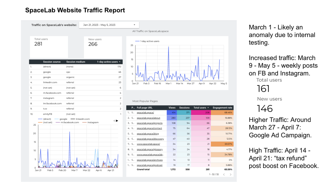
SpaceLab
|
|
- I installed and leveraged Google Analytics 4 data to predict what was effective in our social media, ads, and website.
- Also worked with a cross-functional team to implement advanced tracking for conversion events on the website.
- I managed a marketing team, and co-created marketing materials, leveraging creative commons, AI, and partnerships with creatives.
- Tools: Presentations · Management · Google Analytics 4 · Google Tag Manager · A/B/Multivariate Testing · Cookies · Digital Marketing
Baynote/Kibo
|
|
"Lauren works tirelessly to manually tweak recommendation quality over all our customer sites and provided valuable feedback to the engineering team in terms of tuning our algorithms. She shows an exceptional understanding of the mechanics and trade offs involved in our often highly mathematical models of user behavior."
Team Member
Baynote/Kibo
(Full recommendation viewable on Linkedin)
Team Member
Baynote/Kibo
(Full recommendation viewable on Linkedin)
Expedia
(Speculative Redesign through UC San Diego Program)
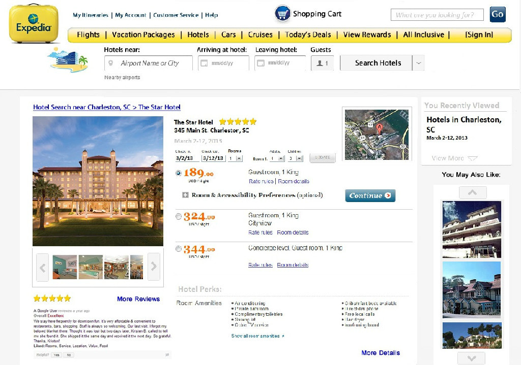
|
In my redesign:
|
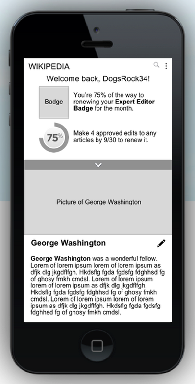
Wikipedia
|
This project was conducted through Cooper's UX Certification Program in partnership with Wikipedia, and leveraging a group of recruited target market individuals.
Goal: Wikipedia desired more volunteer hours, and wanted to re-design their mobile app. My Method:
|
|
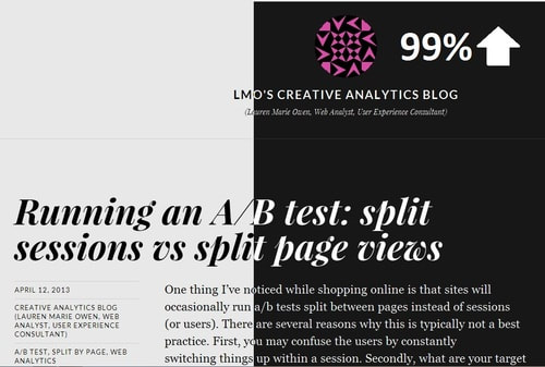
Blog