The Creation of EcoGarden App
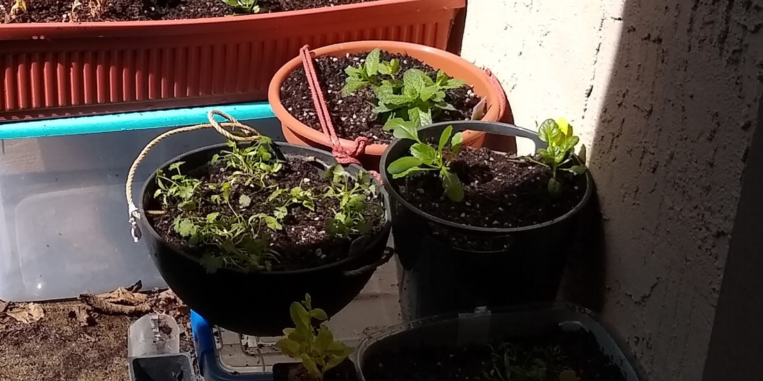
Problem: I noticed my garden was very small, sad and wilting. It's hard for me to remember when to water each plant.
Solution #1: A garden calendar/task alarm app.
Research to inquire if this is a desired product:
Competition research:
Research to inquire if this is a desired product:
Competition research:
- I Googled "gardening calendar app" and looked at the top 10 related apps, and tested them for usability, and looked at reviews for each app.
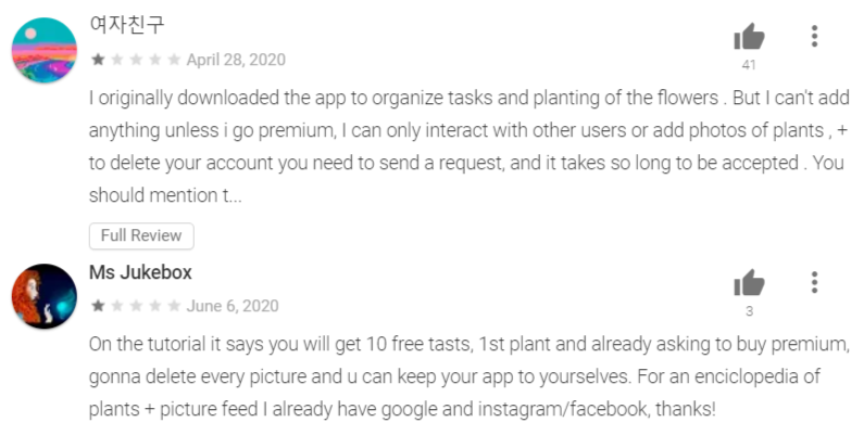
A. The competition has these issues, as evidenced in their app and reviews:
B. In response I could do the following:
- They do not allow users to try out the app much at all before they have to subscribe (no free trial).
- Bullying happens on the social part of app.
- The app had too many requests for photos and info.
- No free tips about plants.
- Subscription was too expensive.
- Needs an offline mode.
B. In response I could do the following:
- Allow free 30-day trial (to address concern 1).
- No social on site, but they can easily share on Facebook if wanted (addresses 2).
- Less in-depth requests for personal info (addresses 3).
- Free tips about your plants (addresses 4).
- Lower cost subscription or ad-based model, depending on maintenance costs. (5)
- Offline still works, and sync happens when you are connected, so you're backed up (this addresses 6, and still provides the convenience of online mode).
Leveraged Social Media for UX Interviews:
Posted different questions many times, on social media to gather relevant feedback from a variety of people.
Posted different questions many times, on social media to gather relevant feedback from a variety of people.
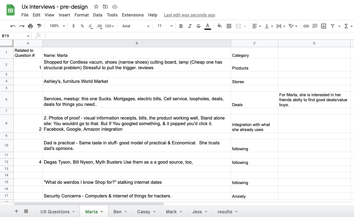
Different questions were used across several posts.
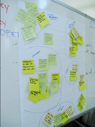
Affinity Map:
I wrote out the key concepts from the user research on post-it notes, and organized them by categories. This helped surface some of the driving motivations and behaviors of the group.
I wrote out the key concepts from the user research on post-it notes, and organized them by categories. This helped surface some of the driving motivations and behaviors of the group.
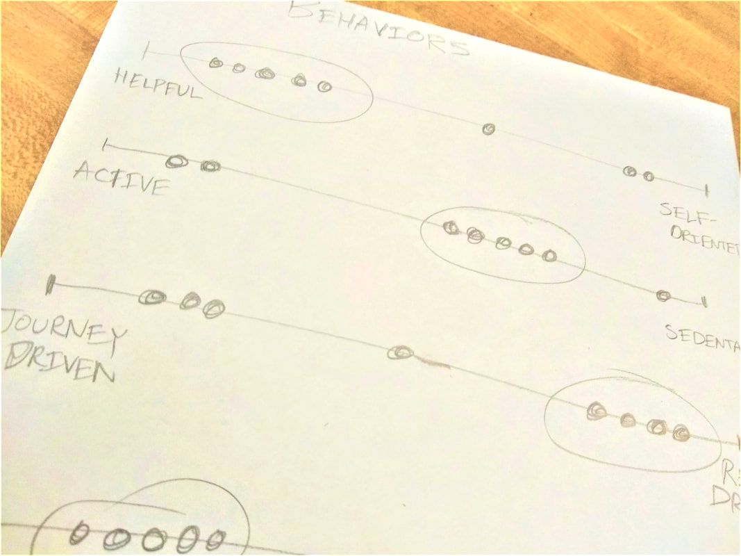
Behavior Spectrum:
Synthesized behavior data from participants using a Behavior Spectrum (below) to form several key Personas.
Synthesized behavior data from participants using a Behavior Spectrum (below) to form several key Personas.
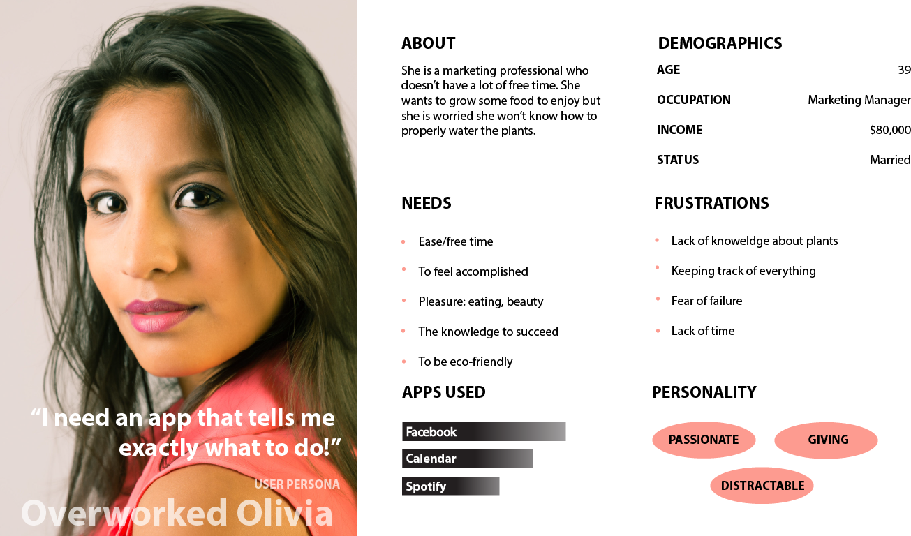
Here is one of the 2 Main Personas:
Research conclusion:
The User Research, Affinity Mapping and the Personas indicated the product needs to change.
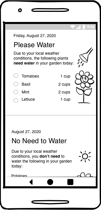
Solution #2: EcoGarden App
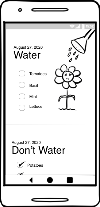
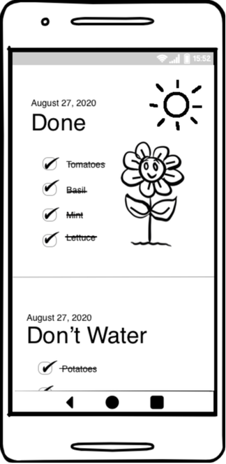
What it does: Tells you if you can skip watering your plants today or not, based on your local weather conditions.
The User Research, Affinity Mapping and the Personas indicated the product needs to change.
Solution #2: EcoGarden App
What it does: Tells you if you can skip watering your plants today or not, based on your local weather conditions.
The artwork responds to what the user is doing: When the user checks off the list, the flower grows happier and healthier.
|
|
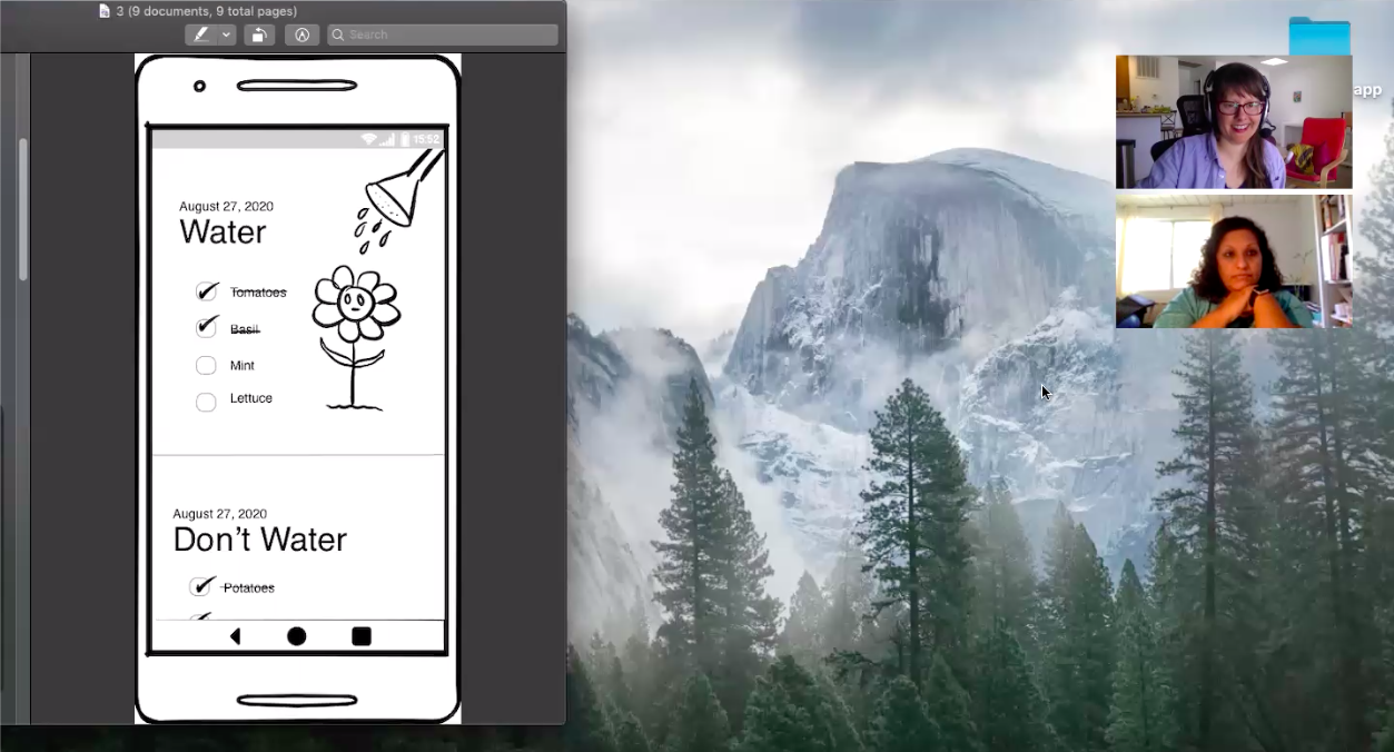
Remote User Research Interviews using Video Conferencing
- I conducted Video Conferencing with users using Zoom, Google Groups, and other conferencing software. I am able to ask the users what they would do, why, what they expect, and show them the next screen that would occur in response, using the latest virtual, online UX testing techniques.
UX Research Question Examples:
Demographics & Personality
Usability Testing
"I want to know your thoughts and feelings as you experience our app."
Task-driven Feedback
Motivations related to our App:
Demographics & Personality
- Age
- City
- Profession
- Income
- Hobbies
- Challenges
- Goals
- Types of apps they spend money on
Usability Testing
"I want to know your thoughts and feelings as you experience our app."
- What are you thinking as you look at this?
- What information is being communicated to you?
- What thoughts or questions do you have as a result?
- What do you want to do next?
- Why?
- What do you think will happen?
- What is confusing?
- Is anything causing negative emotions? What? Why?
- What do you like? Why?
- What do you wish was there?
- Do you trust the information? (If not, what aspect? Please explain...[relevant questions to pinpoint friction] )
Task-driven Feedback
- Is there anything you would do in the app after watering your tomatoes outside?
- How would you find out why your potatoes didn't need to be watered?
- How would you add a new plant in the app?
- How would you look at your water savings?
Motivations related to our App:
- What app would you like this app to be more like? Why?
- What was the one thing you would most want to change about this design?
- What was the thing you liked best about the design?
Here is some of the initial synthesized data:
UX REPORT INSIGHTS:
A. Users did not quickly understand what was being communicated.
User quote: "Oh, I didn't realize it was telling me to water plants."
Solutions:
B. Users were confused by the sad flower being watered.
User quote: "Why is it sad if it's being watered?"
Solutions:
A. Users did not quickly understand what was being communicated.
User quote: "Oh, I didn't realize it was telling me to water plants."
Solutions:
- A brief text description where necessary.
- Revision of the use of checkboxes for unactionable items.
B. Users were confused by the sad flower being watered.
User quote: "Why is it sad if it's being watered?"
Solutions:
- While the sad flower was to indicate the flower needed water, this was not conveyed.
- The flower can be made happy to indicate water = good.
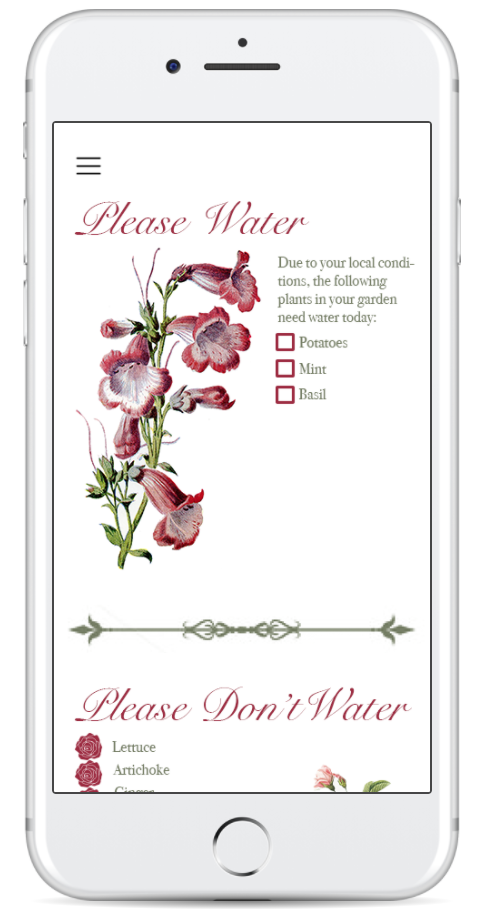
Main Screen Redesign:
Conclusions:
- While the initial idea was for a reminding system, what surfaced in the research was the much stronger desire for information, ease of gardening, and a desire to be eco-friendly.
Created in Adobe Photoshop
