|
Bounce rate is best used as a supplemental metric and not as a main Key Performance Indicator (KPI). Why? First, because someone may look at your page, find exactly the information they need, and then leave. This would count as a bounce even though the page met the user’s needs. They might even come back later, having thought about the information, and become a paying customer. Secondly, someone may accidentally click on a link to your page, and surf away within one second. This would count as a bounce, but does that mean your page should change? No. They weren’t going to stay on your page, no matter how fabulous the design or content is on your page. So what KPI might you add to your tool kit to find out if your page engages users?  Try engagement rate. Set up an event to fire after 5 seconds, if a user stays more than 5 seconds, it should count as an engagement with your site. Then look at the percent of these engaged users who visited this page over total users of this page. You can compare your pages’ engagement rates to one another to get more of an idea of which pages might need design/functionality improvements.
5 seconds is enough time to read 18 words or recognize 1000's of "pieces of visual information." It also allows 1-3 seconds load time while still requiring another 2 seconds of on page time, still enough to read 7 words. (Most major sites try to stay under 3 seconds load time as they know that as page load time goes from one second to three seconds, the probability of the user leaving increases by 32%.) A click, scroll, or visit to another page on on the site can also count as an engagement. Engagement rate using all of the above will be lower than your bounce rate because you will not be counting people who got something out of your page and then left, as a bounce. Then you can gauge the true success of the page and even its paid marketing source. Happy analyzing! For more information on what I do, please visit: LaurenMarieOwen.com.
0 Comments
For this fictional Superstore, I wanted to know what products returned lower than average profit margin. My goal was to discontinue products that returned less than average profit (4.7%) and see how this might impact our popularity.
Dynamic, interactive chart:
Action: Based on a quick visual look, you can see that Machines, Tables, and Binders are the smallest (less popular) of the less profitable items. These should immediately be considered for discontinuation.
Other Notes:
I only showed contrasting colors between a profit rate of 1.7% and 7.7%. However, the true range is between about -24% and 19%. Contrasting the middle gives us a good idea of where the cut off should be for some products. Mustard yellow: the left side of the legend, the strongest hue is down to 1.7% and even lower in this bucket. Gray: around 4.7% profit. Purple: the right side of the legend, 7.7% and even higher.
Notes about the graph:
The average profit margin of these sales is 4.7%. I showed the contrast 3 percentage points above and below, which tosses things into contrasting buckets. While a pie chart might best work with 3 or fewer segments, a treemap works well with many. People would have trouble seeing the many tiny slivers of pie chart and comparing them. The following is from my analysis of an online magazine:
https://www.laurenmarieowen.com/sample-data-analysis-report.html First, here's my smoothed graph using the last couple weeks' data: 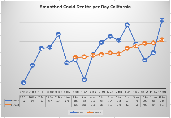 Why? Because IHME and Google are not giving us a clear view of the data yet, today. IHME hasn't updated their data since Dec. 23. They are only showing what they thought the data will be at this time. And Google's data is too jagged to make sense of: 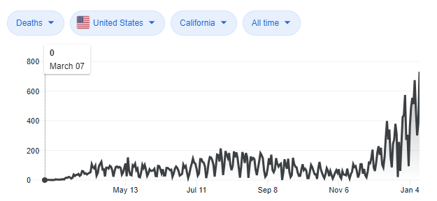 So I have smoothed the data from the last 2 weeks or so to give an idea of where we are at this time in the pandemic. It averages the last 7 days including today, to give us a view of how Covid is affecting people in California.  As you can see, it's trending up, with the latest value estimating on average about 517 deaths per day on January 12, 2021 in California. I used "Moving Averages" for this project because I theorized that even if the reporting is actually on time each day, and if people really do tend to die in large numbers on certain days (as opposed to some numbers coming in for Monday that should have been assigned to Sunday)--even in either scenario--taking the local average (of the last 7 days of data) gives us insight into if the death toll is going up, and by about how much on average. How quickly is this disease rampaging? As it stands, the averaged numbers of deaths are going up at this moment, and are over 4 times California's previous highest days in August. Update on 1/18: On reflection, taking a week by week average (one data point for each week) is going to be a better indication of where we are, as there are always strong outlier days. The weekly average for 1/10 to 1/16 (7 days) is 527. Update on 1/23: Google has updated their graphs to the same 7-day moving average as my graph above. An example: 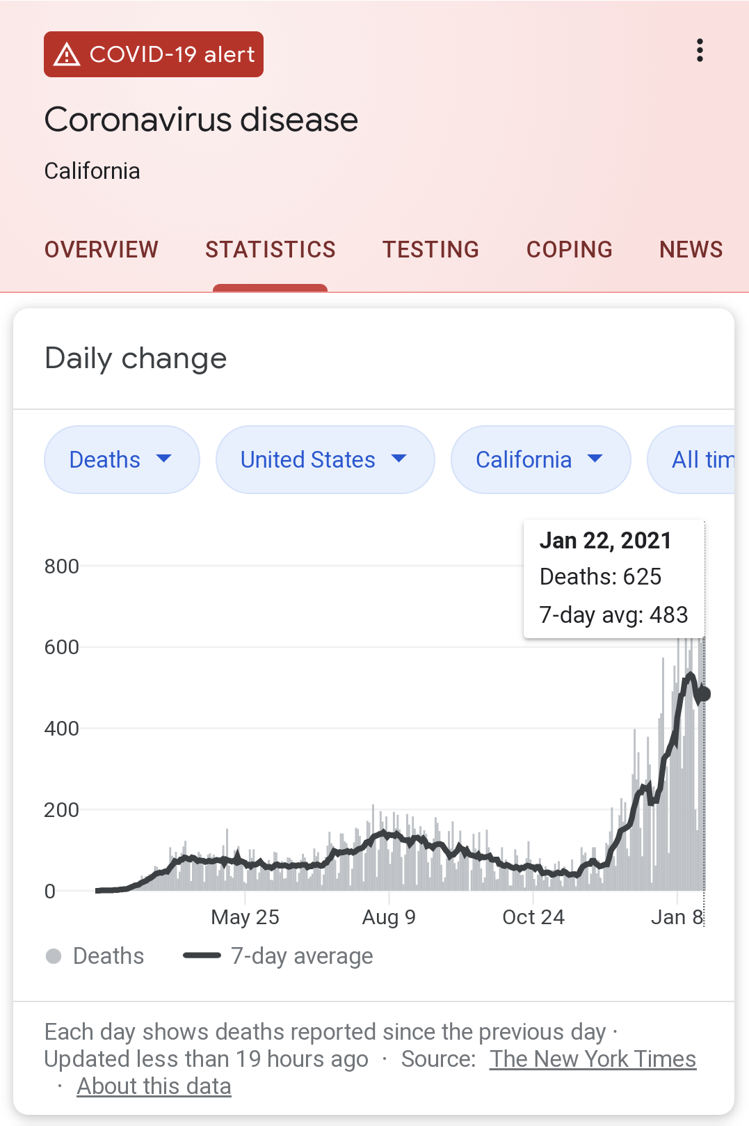 Covid-19 Data sourced from Google:
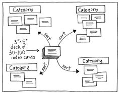
https://support.google.com/websearch/answer/9814707?p=cvd19_statistics&hl=en&visit_id=637461654857334961-325260020&rd=1 Do you have a complex program that requires many tools to be intuitively arranged and easy to find? One method to find out how your users will look for these tools is to do the card sort. Card Sort:
 When running user experience tests, you can find our what’s hard to use or unclear about your design. Clarity is king. Despite popular opinion, substituting images for text can often alienate potential customers who can’t figure out what you mean quickly enough. So instead of this: You could use something like Microsoft Office does, a combination of pictures and text: Alternately, for the tail of users that desire only visual icons, you can also study how quickly new users pick up on your symbolic images and how motivated they are to do so.
Today’s software complexity is growing, and with that comes a great need to manage interactions in a clear and engaging way. |
 RSS Feed
